Have a naming convention.
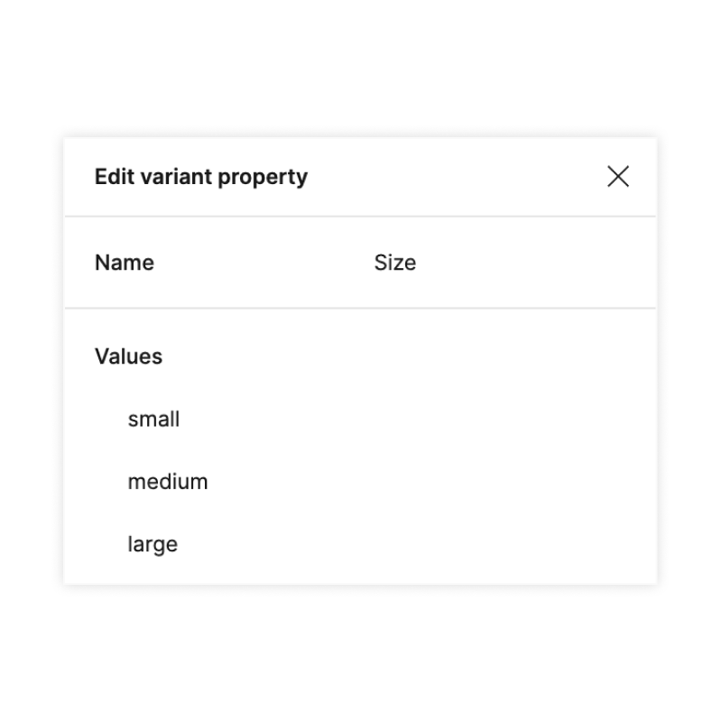
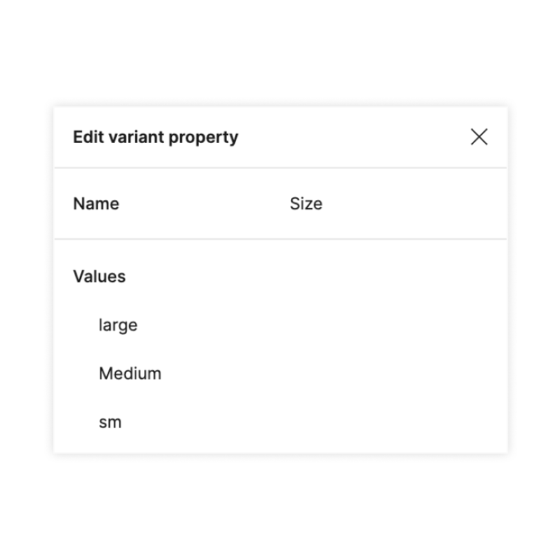
Components, their properties, and their values should have a consistent naming convention. For example:
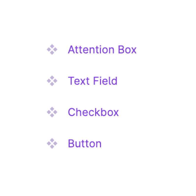
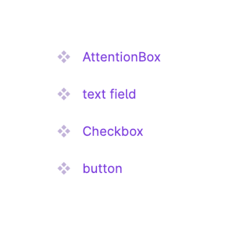
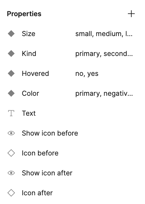
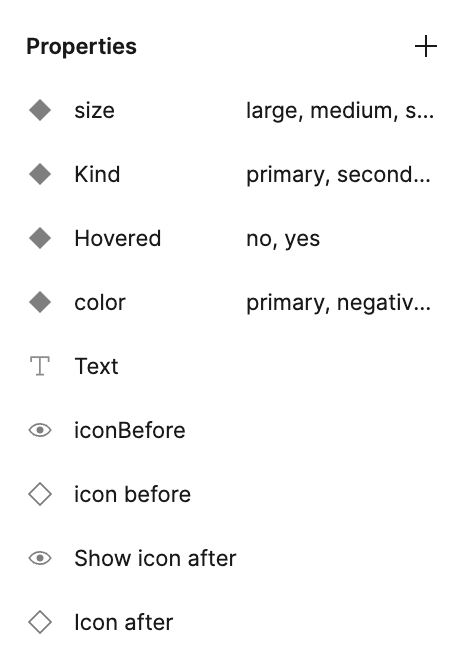
- Component names are uppercase, with spaces between words.
- Property names are capitalized.
- Property values are lowercase.
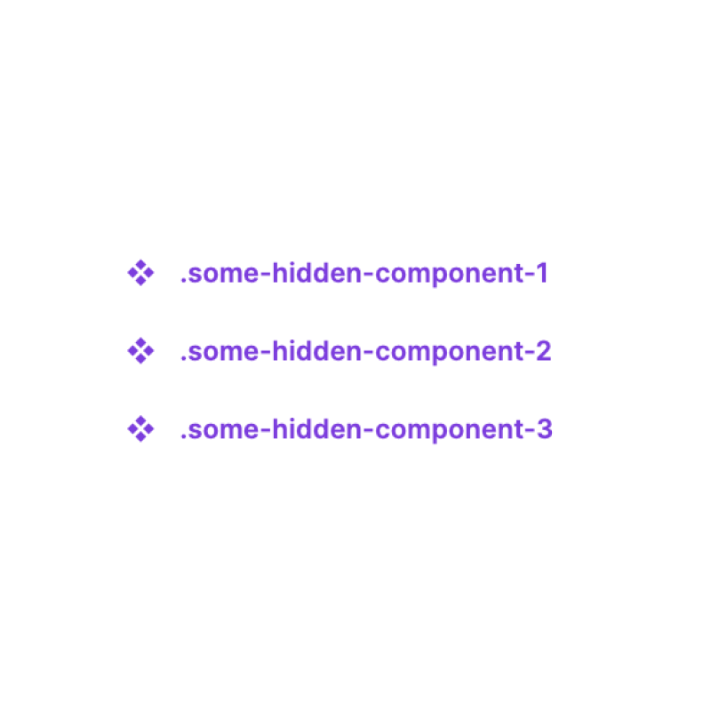
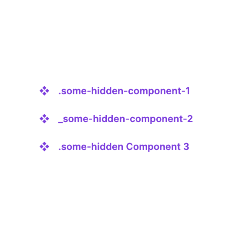
Naming convention should also apply to:
- Hidden components. For example, you can choose to use a dot as prefix, keep words lowercase, and separate them with dashes.
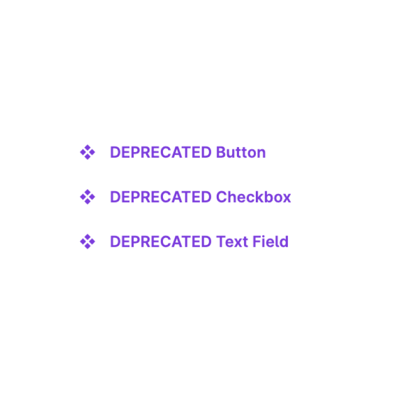
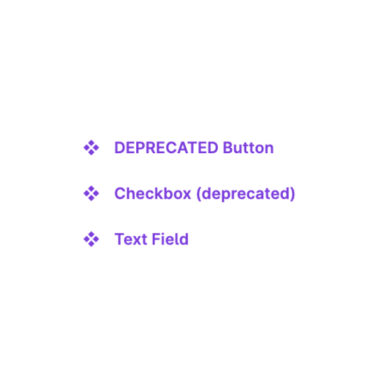
- Deprecated components. For example, you can add "DEPRECATED" before component name.
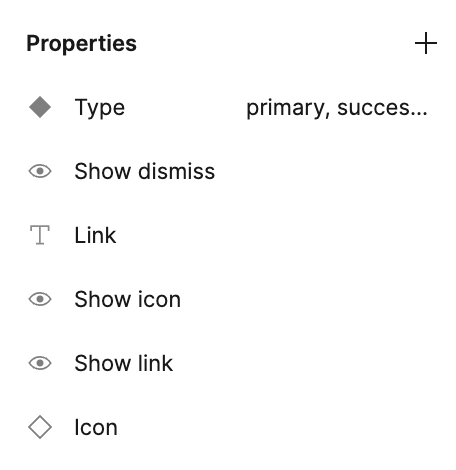
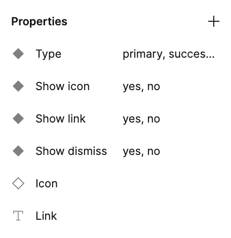
Put properties in a logical order.
Top-down order of component properties should match the reading direction of the component.
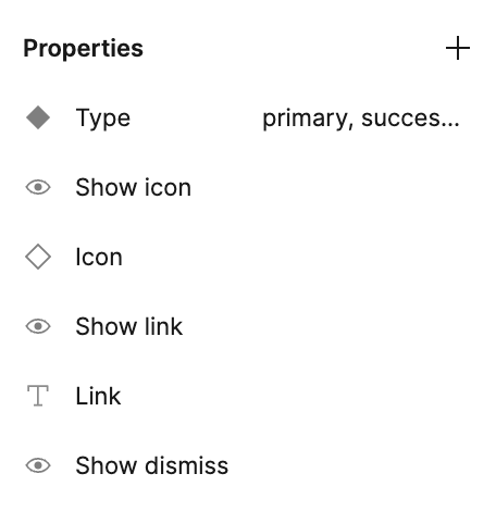
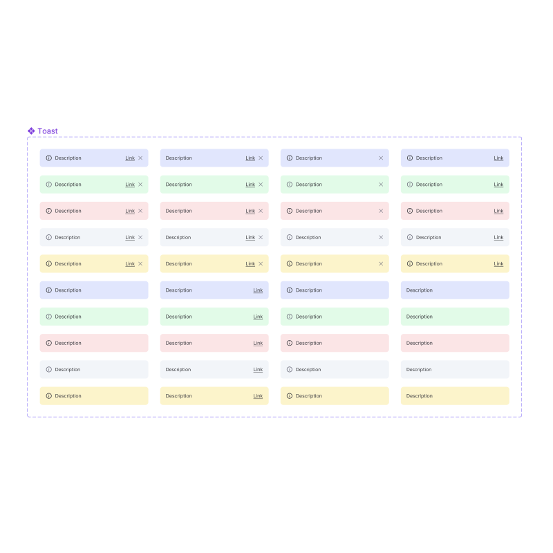
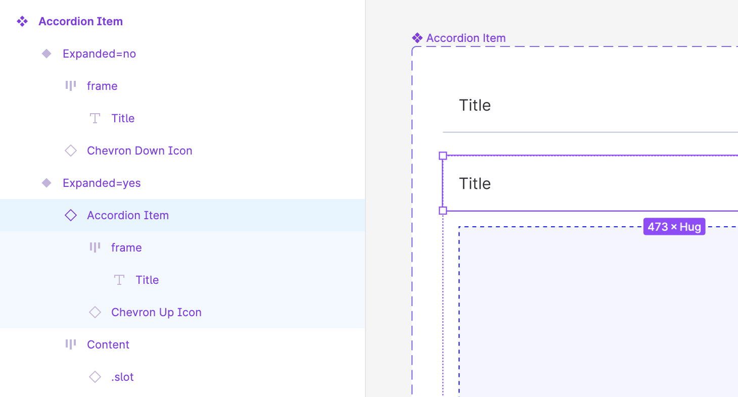
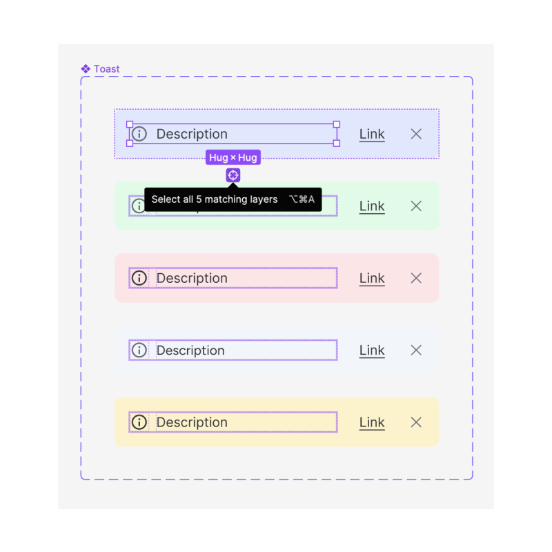
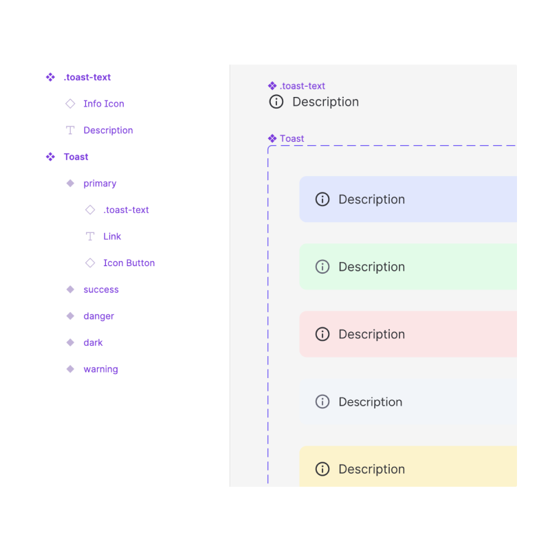
Favor boolean component properties over variants.
Use boolean properties for toggling the visibility of component layers. This will reduce the component size and make it much more manageable.

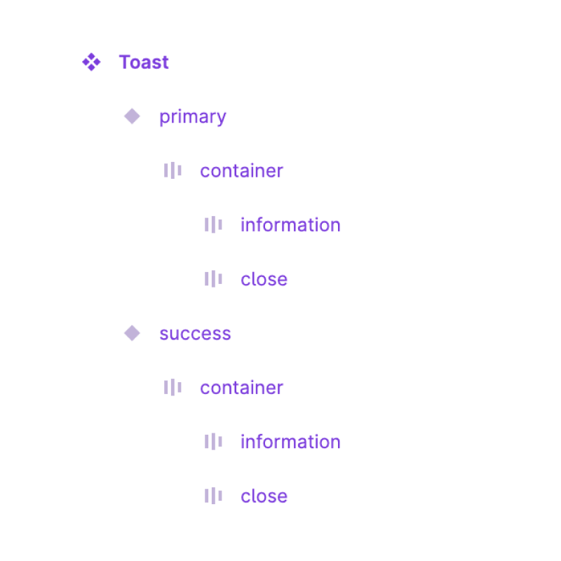
Name your layers.
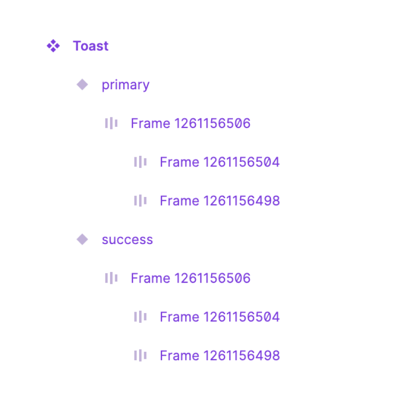
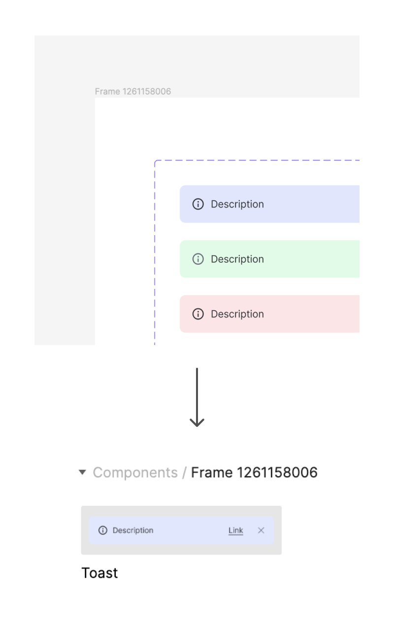
All component layers should have names. While semantic names are best, it it's okay to have something as simple as "container" or even "frame" (just not "Frame 1453583").
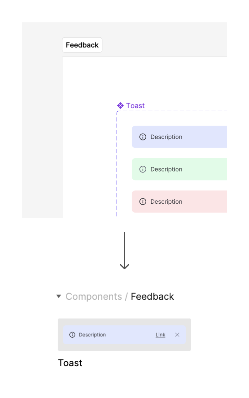
Don't nest components in unnecessary frames.
Placing components inside (unnamed) frames can make it more difficult to use the component, because it creates additional nesting in the Assets panel.
Of course, you should still use this feature intentionally :)
Don't create recursive components.
Don't use an instance of a component to create another variant of that component. This creates a poor experience for everyone who maintains and uses the library.
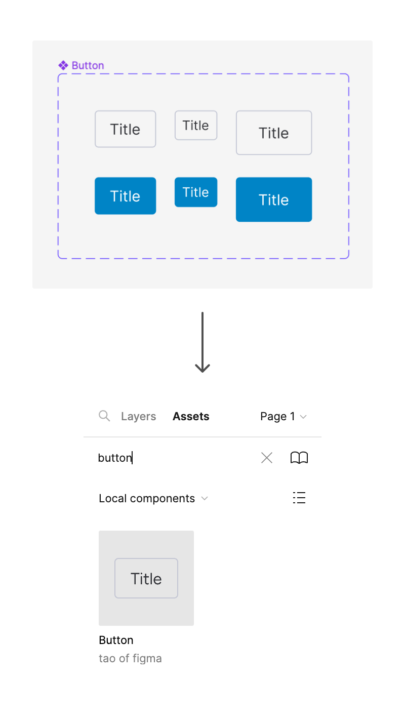
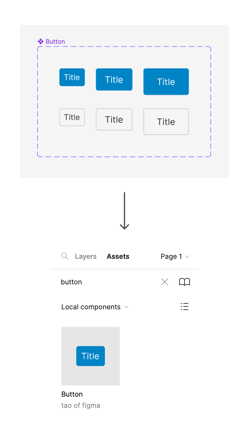
Set most commonly used variant as the default one.
Place the most commonly used variant in the top left corner of the component set to make it the default one. This will greatly reduce the amount of time designers spend on component configuration.
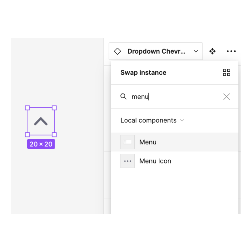
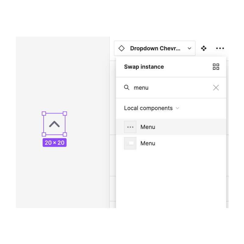
Make icon components obvious.
You can add "Icon" at the end of the name. This makes it easy to differentiate it from a different component with a matching name:
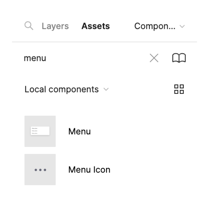
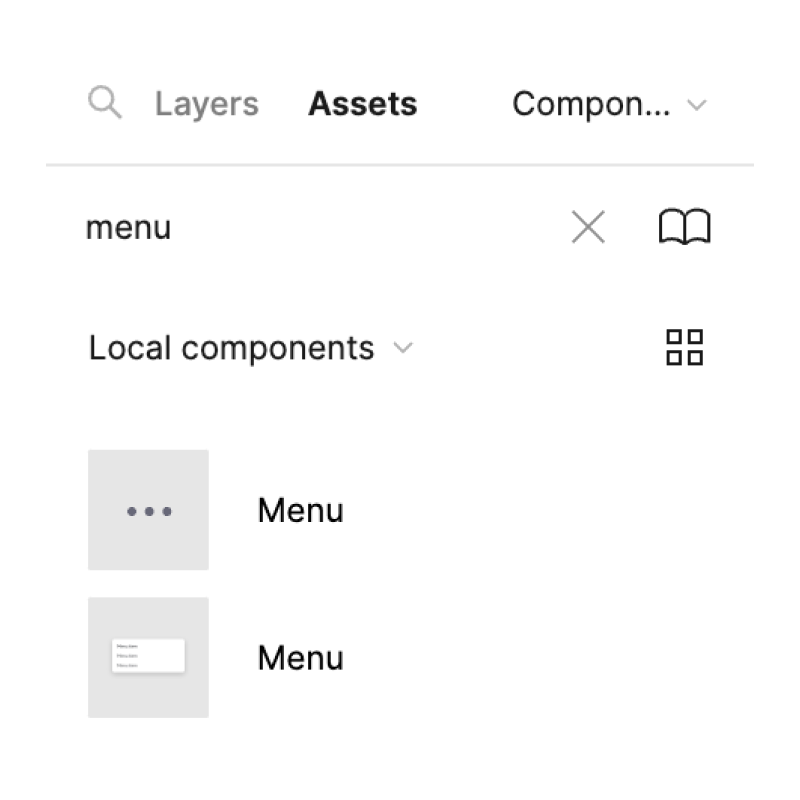
This becomes even handier in the instance swapping settings (since the thumbnail is much smaller that it is in the Assets):
Don't create unnecessary components.
Not everything has to be a (sub)component, especially when it comes to component parts. The selection tool makes it easy to update component parts without resorting to creating another (most likely hidden) component.
Don't create unnecessary documentation.
The best way to learn about a component is by playing with it. Adding documentation inside Figma is usually not effective, because most designers don't keep the component library file open as reference. They primarily interact with the components through the Assets panel. Adding unnecessary documentation also creates more unnecessary management work for the library maintainers.
If you want to have documentation, the best way is to have a simple website that everyone at your company can access.